 Some would say ‘they are
only stripes of colour, nothing else. I could do that. What’s so special?” Yes, there is no shape or form that would
suggest any real connection to an object, yet my eyes hurt from staring for so
long. A reaction; I came to realize a
missing element of design or a result of using one of the most important
elements, colour, that causes us to react.
Regardless, I spent over an hour in looking at The Plasticiens and Beyond. Montréal 1955-1970 in The National Museum of Fine Arts in Quebec City, back in
February. The images and intensity still
rest in my mind after all these months.
Some would say ‘they are
only stripes of colour, nothing else. I could do that. What’s so special?” Yes, there is no shape or form that would
suggest any real connection to an object, yet my eyes hurt from staring for so
long. A reaction; I came to realize a
missing element of design or a result of using one of the most important
elements, colour, that causes us to react.
Regardless, I spent over an hour in looking at The Plasticiens and Beyond. Montréal 1955-1970 in The National Museum of Fine Arts in Quebec City, back in
February. The images and intensity still
rest in my mind after all these months.
When viewing the show I
ended up going backwards and began with the third generation of The Plasticiens. It was a super sonic
bold transformation from Riopelles palette paintings, to a change in direction with the first generation of the Plasticiens artists, that were stronger in line and used more defined colours throughout.
The third generation made an advancement or shift in the artistic process where technique was
precise, meticulous yet simple in composition.
Ripoelle contrasting process shows a controlled play of paint and heavy
application with an intense moving energy that went into creating the piece, and for me caused an immense emotional reaction.. Whereas the Plasticiens used simple line and strong colours to
create a reaction that ironically for me was calming due to the intense focus I
needed to absorb each piece. Pushing the
limits through size, technique, and use of principal of perimeter, makes me very grateful that I was able to see The Plasticien in person.

I too receive the same feedback
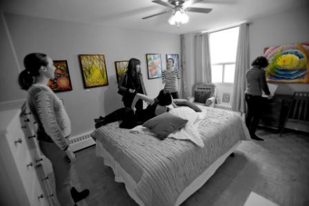
from viewers of my work that it is so different and the intensity of colour, detail, line and emotion were greater in person. Sometimes viewers feel it's not even the same work and are a bit taken back. A fellow artist, Elaine Waddell, who came to my recent show Connecting Dreams, said that the images on my website did not do the work justice as the build up and colour are so different in real life. A reaction; the energy emitted from a piece along with the uses of colour, texture, and line bring the viewer into an imaginary world. A world that for me is one of the most important aspects of my art, as I use it to pull my viewers in.
 Feelings and passion cannot be taught yet there are some principals and technique that are useful to master. Being mostly self
taught I usually go on instincts and use the basic principals that I
teach my elementary students on composition and the elements. I was
thankful to receive some very constructive feedback from John Blaise, a long time art teacher and artist,
that has made my creative path even clearer. He explained that a piece can be either narrative, abstract, or realistic. Some artists challenge these groupings by contrasting abstraction with elements of realism but for me right now I would like to master narration and abstraction before plunging into contrasting types of work. We talked about colour and how certain colours trick the viewer into thinking they are receding or advancing. He also explained how principal of perimeter helps strengthen the composition of a piece because the shapes in the piece mimic the perimeter of the work. It is well known that mastery comes from extensive hours of practice so one of my next goals is to create 200 paintings in one style; which will be with rock paper focusing on colour and abstraction. On an overall level I want to connect my viewers to my work on a deep level both emotionally and cognitively.
Feelings and passion cannot be taught yet there are some principals and technique that are useful to master. Being mostly self
taught I usually go on instincts and use the basic principals that I
teach my elementary students on composition and the elements. I was
thankful to receive some very constructive feedback from John Blaise, a long time art teacher and artist,
that has made my creative path even clearer. He explained that a piece can be either narrative, abstract, or realistic. Some artists challenge these groupings by contrasting abstraction with elements of realism but for me right now I would like to master narration and abstraction before plunging into contrasting types of work. We talked about colour and how certain colours trick the viewer into thinking they are receding or advancing. He also explained how principal of perimeter helps strengthen the composition of a piece because the shapes in the piece mimic the perimeter of the work. It is well known that mastery comes from extensive hours of practice so one of my next goals is to create 200 paintings in one style; which will be with rock paper focusing on colour and abstraction. On an overall level I want to connect my viewers to my work on a deep level both emotionally and cognitively.
No comments:
Post a Comment